I found this
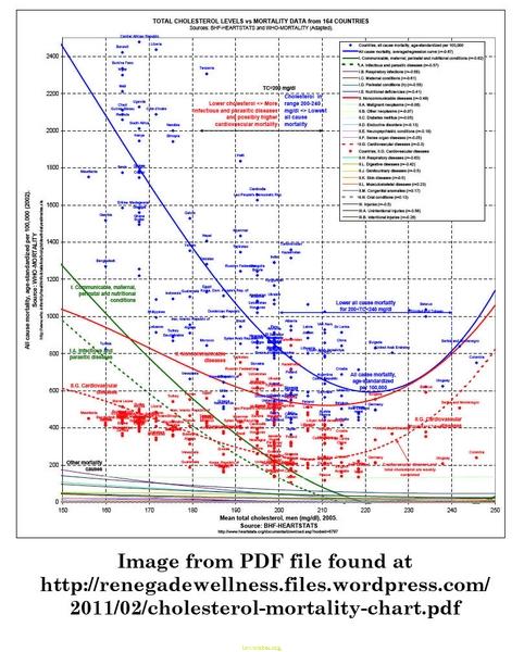 at - http://renegadewellness.files.wordpress.com/2011/02/cholesterol-mortality-chart.pdf
.
The data is from the World Health Organization. I tried to go to the URL shown on the chart axis, but they did not work - for me - maybe someone can find the correct link.
It is a bit "busy" for a plot, especially at the scale shown. If you go to the link to renegadewellness.files.wordpress.com, you will get a PDF view that will let you scale up (or down) to view the detail easier.
The solid
BLUE line is for - All Cause Mortality, average/regression curve (r=-0.67)
The
BLUE dots are the data points for each countries deaths for all causes, age-standardized per 100,000.
The solid
GREEN line is for - Communicable, maternal, perinatal and nutritional conditions (r=-0.62)
The dashed
GREEN line is for - I.A. Infectious and parasitic diseases (r=-0.57)
The solid
RED line is for - Noncommunicable diseases (r=-0.49)
The
RED dots are the data points for each countries Cardiovascular Disease deaths
And the dashed
RED line is for - Cardiovascular diseases (r=-0.3) NOTE: the tag on the line says "Cardiovascular diseases and total cholesterol are
weakly correlated" indicated by the shallow curve of the line. AND if you look at the distribution of the
RED dots, they are all over the chart (seemingly as many above as below the line) making you wonder how the "curve" really fits the data.

It is interesting that both green lines drop to zero at 220 mg/dl of total cholesterol. Could it be that high total cholesterol is a immune system enhancer!?! But most important is that the lowest rates of all cause mortality
are for cholesterol readings of 200<TC<240 mg/dl.
I didn't like the "curve fit" for the Cardiovascular diseases -
RED dots, especially the right end where the data points do not justify the steep rise. And, for that matter the rise on the left does not fit the data points very well there either! So here is a new graph with the
BLUE line, All Cause Mortality, average/regression curve and the
BLUE dots, the data points for each countries deaths for all causes, removed. I then added
BLUE dots to show where I think they fit the data points better. I hope you will agree. Here it is:

Note the "curve" is almost flat as you would expect if there is poor correlation between the two axis. And if anything it slopes down as cholesterol goes up.
** edited to add **
In 1987, in the Journal of the American Medical Association Framingham Study investigators reported these two important findings: 1) Over age 50 there is no increased overall mortality with either high or low serum cholesterol levels, and 2) In people with a falling cholesterol level (over the first 14 years of the study), for each 1% mg/dl drop in cholesterol there was an 11 percent increase in all-cause mortality over the next 18 years. (JAMA 1987;257:2176-2180) **end**
I hope this is informative for everyone.


 Linear Mode

